Introducing the Tiaki Wai identity
Tiaki Wai marks the start of a new chapter for water services in the Wellington region. We now have a visual identity that represents transparency, stability, strength, and our commitment to taking care of the environment and vital infrastructure.
The visual identity was developed with input from mana whenua, council partners, the current water services workforce, and tested with customers. It has now been approved by the Tiaki Wai Board.
The name Tiaki Wai, gifted by mana whenua, carries deep meaning: it represents our commitment to care for people, place, and wai - the life force that connects us all.
Our visual identity mirrors the journey of water through our region, flowing from the ranges, down the valleys and into our harbour.
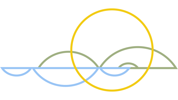
Our wordmark (a text-only logo) further celebrates the rhythm and flow of water. Inspired by ngaru – the waves formed by a canoe cutting through the water.
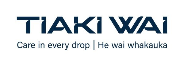
The line ‘Care in every drop | He wai whakauka’ is an extension of the meaning of ‘Tiaki Wai’ (carers for water). It sits alongside our wordmark and succinctly captures what we stand for and what we aim to do.
He wai whakauka is a descriptive meaning for “care in every drop”. It’s not a word for word translation. He wai: water. Whakauka: to be lasting, sustained, preserved.